-
identity
- athénée
- théâtre olympia
- nest
- comédie de béthune
- théâtre 71
- théâtre croix-rousse
- orchestre régional de Normandie
- pronomades
- zat 2022
- comédie de reims
- royaumont
- gallia théâtre cinéma
- couleurs bobigny
- bobigny monde
- ondif
- le carré
- zat
- cité maraîchère
- ACTES
- orchestres rf
- hivernales
- parvis
- houdremont
- comédie-pc
- la maison des métallos
- demain la Seine-Saint-Denis
- avignon
- pascal contet
- isadora
- merle moqueur
-
spaces
- saint-ouen 2030
- l’envol des pigeons
- atelier d’architecture philippe prost
- ailleurs commence ici
- mikado flowers
- vibration
- maison pop
- new G
- nuit blanche 2023
- mots voyageurs — roubaix
- barbusse
- quai M
- korea now!
- ballets suédois
- cité immigration
- de la lettre à …
- mots publics 2008
- mots voyageurs — belleville
- forme publique
- galaxie des mouvements
- ici tu es
- mots-frontière
- blanche neige
- cartier
- d-day
- cnac
- berges de seine
- magenta
- pôle molière
- Maison POC Économie Circulaire
- faites la place!
- cartographie
- abreuvoir
- typographie
- édition
- studio
d-day

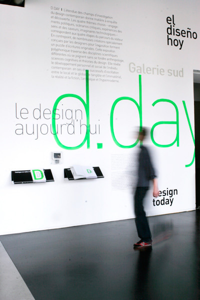
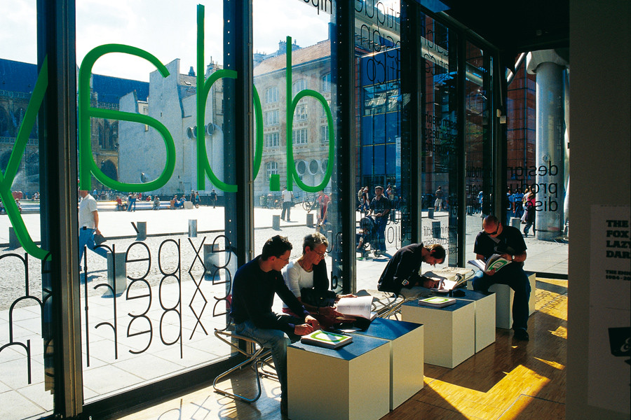
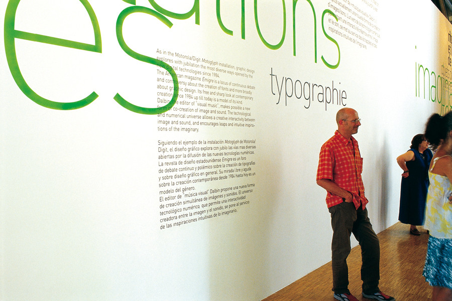

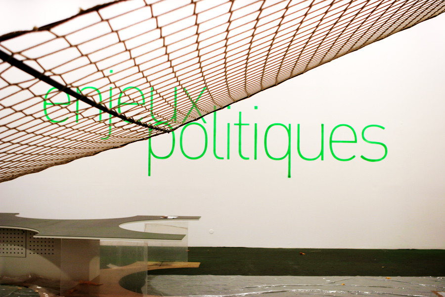
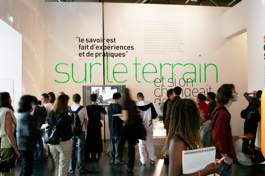
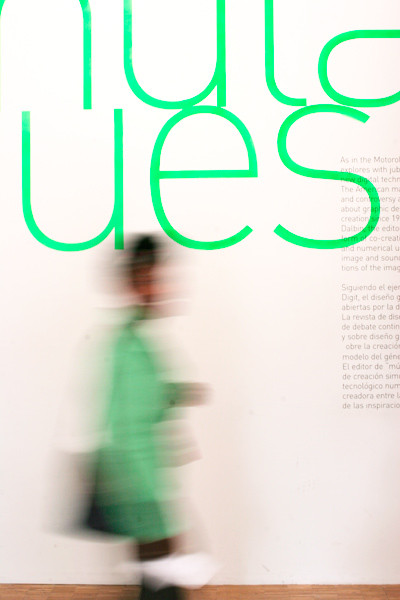
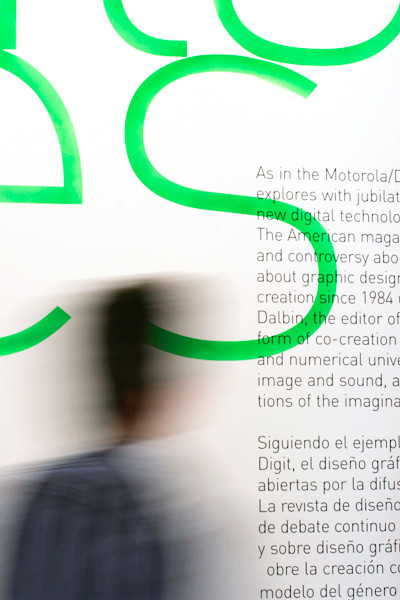
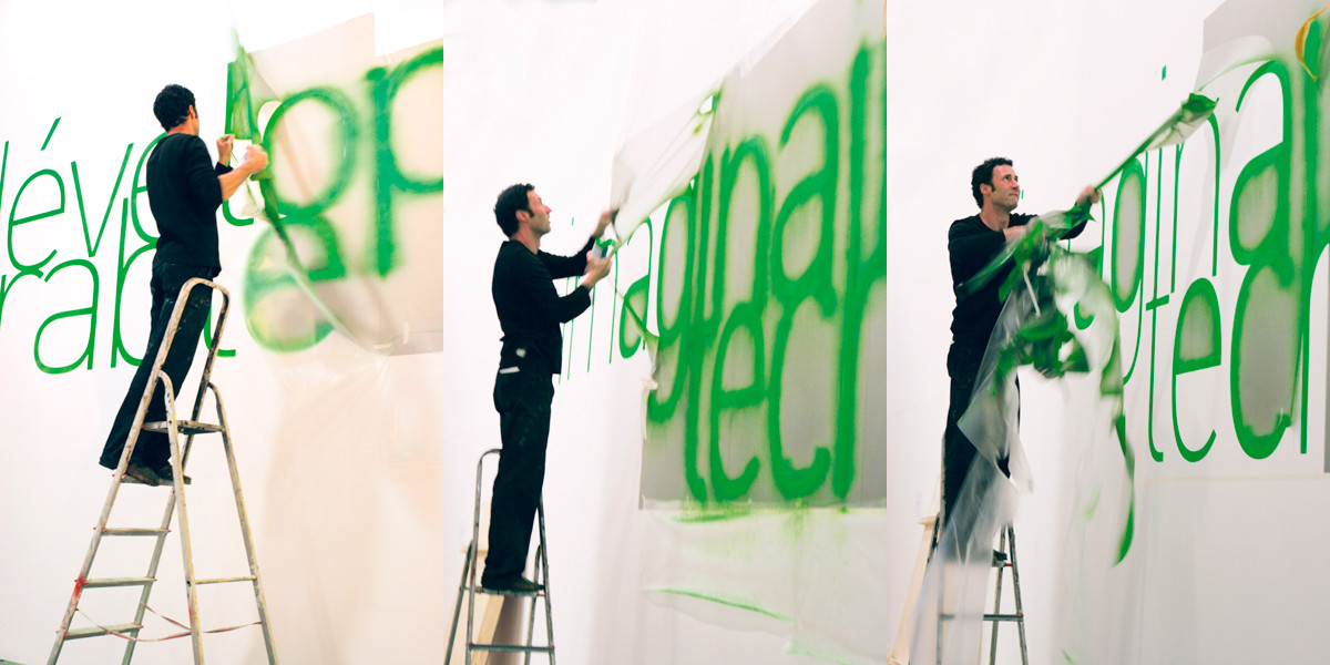
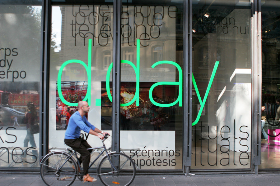
exhibition "D-Day" at the Centre Pompidou 2005
My desire was to translate a thought of design a little indirect ; a design that is not in the obsession of controlled shape, smooth and industrial ; a design that allows the human accident, elegance with ruggedness. Hence the choice of a typography which is now part of the standards of design - the Din - but treated in the headlines with fluorescent color and with stencil with sharp edges, as well as soft edges, the result of the imperfection of can spraying. Each title was surrounded by texts with different proportions, in black and white. The whole formed clouds of big green fluorescent titles which left room for a "handwork accident," the irregularity.
design of the exposition,
manifesto texts and scenography : Malte Martin
design of the 240-page catalogue : Malte Martin
with Juanma Gómez
Pas d'actualité pour l'instant…